Monitoring 30DayMapChallenge 2020 via Twitter API
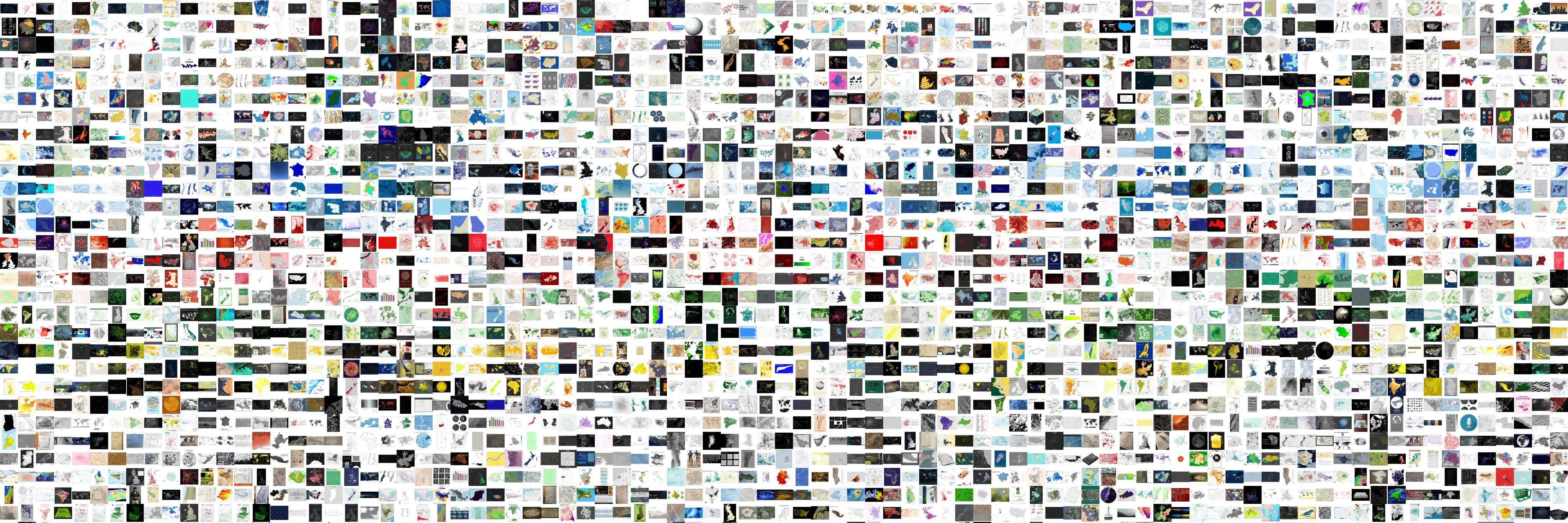 Photo by Haifeng Niu
30DayMapChallenge 2020
As you may know, #30DayMapChallenge event was launched by Topi Tjukanov on Twitter. You can find the repository with detail and helpful resources on Github. It was a digital party for map lovers around the world.
What did I do?
During the past #30DayMapChallenge 2020, I created a repository 30DayMapChallenge-Bot on Github to monitor the activity status of this Twitter hashtag event and conduct some basic statistics. The Twitter data was collected via standard API which was applied via Twitter Developer Platform.

NOTE Please don’t be bothered by the word ‘bot’. I used ‘bot’ in the repository name because I meant to create a fully automated script for posting the daily statistics of #30DayMapChallenge. However, I later found that my plan was over-optimistic about the tweeting behaviours (early entries and many late entries) and the time zone problem. This means that some works have to be done manually.
Data Collection via Twitter API
The data collection was conducted by using the python package tweepy. The main setting in search query includes:
- Set
#30DayMapChallengeas the keyword in the search query. - Exclude retweeted post. Only keep the original post.
- The value for media is not null (exclude post without image)
- Execute search every day with setting the last day as the search date.
Here is an example of tweets with extracted metadata. Separated CSV files for each day can be found in the data folder.
| tweet_id | tweet_text | language | tweet_created_at | retweet | favorite | hashtags | user_id | user_name | user | user_loc | user_follower | friends_count | media | tweet_url | |
|---|---|---|---|---|---|---|---|---|---|---|---|---|---|---|---|
| 59 | 1333557619693391873 | #30DayMapChallenge A map , #Chine #afrique 1... | fr | 2020-11-30 23:44:47 | 2 | 3 | [{’text’: ‘30DayMapChallenge’, ‘indices’: [0, ... | 2493409233 | Africa & Geomatique | geocarta | 308 | 173 | http://pbs.twimg.com/media/EoG_ieAXYAAl9YM.jpg | https://twitter.com/twitter/statuses/133355761... | |
| 61 | 1333554584539815936 | #30DayMapChallenge Day 30: A Map\n\nMissing Gl... | en | 2020-11-30 23:32:43 | 1 | 1 | [{’text’: ‘30DayMapChallenge’, ‘indices’: [0, ... | 579246246 | Cas | cas_maps | 195 | 1050 | http://pbs.twimg.com/media/EoG8KqXWMAANluU.jpg | https://twitter.com/twitter/statuses/133355458... | |
| 62 | 1333554399847870470 | Day 30 (A Map) of #30DayMapChallenge \n\nOrien... | en | 2020-11-30 23:31:59 | 1 | 4 | [{’text’: ‘30DayMapChallenge’, ‘indices’: [18,... | 143843229 | ABC | zerbembasqwibo | 195 | 77 | http://pbs.twimg.com/media/EoG8bxKXEAAls-M.png | https://twitter.com/twitter/statuses/133355439... | |
| 63 | 1333550070701154304 | #Crimea | #Qırım | #Крим 🇺🇦\nThe map labels th... | en | 2020-11-30 23:14:47 | 0 | 1 | [{’text’: ‘Crimea’, ‘indices’: [0, 7]}, {’text... | 921409205080412161 | app4soft 🦖☄ | app4soft | 195 | 0 | http://pbs.twimg.com/media/EoG3YVPWEAIo1Cn.jpg | https://twitter.com/twitter/statuses/133355007... | |
| 64 | 1333542456462340100 | School map of Portugal (6th edition from 1962)... | en | 2020-11-30 22:44:32 | 2 | 20 | [{’text’: ‘30DayMapChallenge’, ‘indices’: [109... | 1125320137853341696 | PedroTarroso | ptarroso | 144 | 80 | http://pbs.twimg.com/media/EoGwQtjW4AA3gJD.jpg | https://twitter.com/twitter/statuses/133354245... |
Can’t wait! Just show me your code!
Don’t want the code! Just show me the data!
Link to the data folder on Github
Daily Statistics
First, I plot daily tweets count to track the participation trends of #30DayMapChallenge event. Then, I sorted tweets the count of favourite on each map theme and selected top (10-15) favourited tweets. To do this, I can efficiently identify those maps which get more attention on that day. Here is e example of the daily post.
Overall Summary
I also gave an overall summary after the last day of this challenge. The summary includes the maps count, involved users count, number of country and language, total retweet count and favourite count. I also made a map to show the distribution of involved users by geocoding their profile location.
Users Langauge
Tweets with #30DayMapChallenge hashtag from 2020-11-01 to 2020-12-02 are in 32 languages (Twitter account setting) including es, en, fr, und, de, ru, lt, lv, no, tr, in, nl, pt, ja, et, ro, ca, ht, tl, pl, sv, da, it, bg, fi, eu, ar, vi, cy, ko, is, uk.
Users Location
By geocoding users location in their profile, I plot the map of the distribution of users who involves in this event. Geocoding process is conducted via LocalFocus. For a high-resolution version, you can find here link.

Map Wall
To intuitively show the surprising number of participants of this event, I made a collage of maps (7569 from 7699) in different background and size (black 64 and white 64).

Haifeng Niu
Research Associate
I am a Research Associate at the Lab of Interdisciplinary Spatial Analysis, Department of Land Economy, University of Cambridge, currently leading spatial analysis work in the European Union’s Horizon 2020-funded project Emotional Cities(WP4). My expertise includes urban big data mining, spatial data science, geo-visualisation, and urban sensing and modelling. I have a strong interest in how the intersection of machine learning & AI and urban big data better supports urban planning, policy-making and smart management.